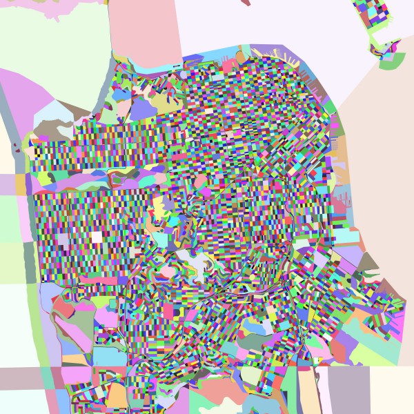
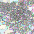
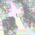
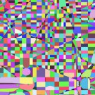
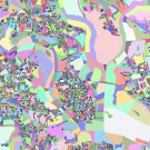
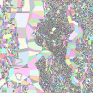
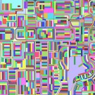
Here at Casa Von Worley, when fresh data strolls though the door, the first thing I do is test its mettle – with a quick-n-dirty visualization. And so, some months ago, to explore my nascent Growth Rings concept, I downloaded the U.S. 2010 Census block geometries, colored them randomly, and plotted a map of San Francisco.
Faith in the Feds? I don’t have much, so I expected a close enough for government work City, cleansed by apathy and sloth of all but the coarsest detail. However, surprise surprise…
Out popped a precise rendition of San Francisco’s crisp-yet-quirky street grid, the sinuous curves of 101 and 280, and every dock and marina on the waterfront, faithfully modeled down to the individual slips. Hubba hubba!
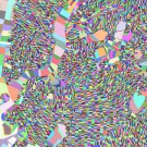
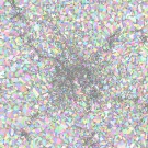
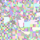
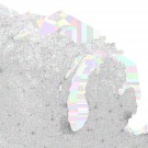
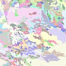
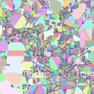
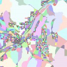
In tribute to the Census Bureau’s hard work – and as a study of how we occupy, manipulate, and subdivide our surroundings – I humbly present these maps, wherein each Census block is colored to contrast with its neighbors and contribute harmoniously to the overall texture. Below, you’ll find New York City, Boston, Seattle, and thirteen other interesting places. Click to embiggen, as always:
At this point, I’d be remiss not to mention artist Jennifer Maravillas and her kindred drawings of Manhattan and San Francisco… created entirely by hand. Wowzers.
Bravo, Jen, and block on, y’all!
