Inspiration comes in many forms, and most recently, as the following carrot, dangled in front of my face by fellow blogger Burrito Justice:
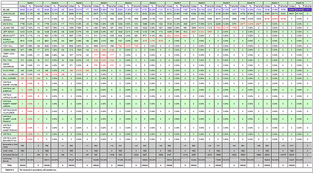
My my, San Francisco Department of Elections, what a big table you have. Because the whole circus – sixteen (16!) people – decided to run for mayor this year, and the City uses the system known as ranked choice voting.
For those unfamiliar, here’s how ranked choice voting works. Go to a polling place, grab a ballot, and mark your favorite candidates in order of preference, one, two, three. First choice is Abraham Lincoln, of course. Second choice, Betsy Ross. Third choice, Winston Churchill. San Francisco elections are pick three, so you’re done. Bask in the warm glow of civic duty.
But don’t bask long, because it’s time to tabulate! Add up the first choice votes. A majority wins, but otherwise, determine the least popular candidate (*), eliminate them, and give their votes to the highest-ranked remaining choice on the supporting ballots. Repeat the process until finished.
In our hypothetical four-way election, suppose the first choices break out 40% Ross, 36% Lincoln, 18% Churchill, and 6% Gandhi. Gandhi is lowest, so he’s eliminated, and his supporters’ second choices split between Lincoln and Churchill. So, going into Round 2, we have 40% Ross, 39% Lincoln, and 21% Churchill. Churchill loses, and per next choices, two thirds of his votes go to Lincoln, and the rest to Ross. Honest Abe wins with a 53% majority.
Now, ramp that up to 16-candidate Frisco, and you get the tabular thicket of numbers pictured above.
In the interest of clarity, Burrito Justice tweeted:
Thanks! Hey @datapointed, time to apply the crayola chart methodology! RT @McClure_SF: @burritojustice http://www.sfelections.org/results/20111108/data/mayor.html via @kevinmonty
Great idea! Then, I whipped up a few drafts which didn’t go anywhere, and, at that point, I shoulda stopped. But Señor Justice had me hooked…
So, using the official San Francisco mayoral election data (as of November 17th), we calculated the trajectory of each ballot: the sequence of candidates that it counted towards in each round of the tabulation process. Next, we eliminated the trajectories for ballots with no valid choice. Then, we rendered each as a fixed-thickness horizontal line, colored by candidate, first round left to last round right. Finally, we stacked them to create a chart where the vertical axis represents the overall fraction of the voting pool.
Here are the trajectories, sorted most common first:
At the top, we see the purple and medium blue of winner Ed Lee and runner-up John Avalos. A first choice of either of those two counted for them all the way through. Next is the bright cyan of Dennis Herrera, dark blue for David Chiu, cream for Leland Yee, and so on. To decode the colors, click through to the large version, which has labels for the major candidates.
The same trajectories, grouped by first choice:
The bars along the left side show the initial preference by candidate. Newsflash: San Francisco isn’t completely colorblind… note the flow of votes along ethnic channels, especially from Herrera to Avalos and Chiu to Lee.
Now, to wrap it up, let’s sort by final result:
On the right margin, we see Lee over Avalos, and large slug of dark gray, representing the trajectories which had no choices left in the race. These exhausted ballots – 27% of the total cast – ended up not counting. That being said, in a sixteen candidate torture test, ranked choice voting trounces the traditional plurality system, which would have degenerated into a government-sponsored festival of wasted votes.
Nevertheless, the “27% exhausted” figure bothers me, so I have to ask:
Is there a fairer way to deal with the insane variety of San Francisco politics? A ranked choice primary to narrow the field, followed by a ranked choice runoff?
Let’s take a vote.


