Woohoo, it’s 2011! Happy New Year to you and yours, and oodles of health and happiness in the coming months.
This Christmas holiday, as I tobogganed through the remote Montana wilderness, I found myself pondering this blog. Quite frankly, although I try to keep my short blurbs lively, similar stuff can be found in slightly-reheated form on a zillion different sites across the Internets. Data Pointed’s true allure – and my heart – is in its original content: the hand-crafted visualizations and lovingly-written stories that I cook up from scratch.
You, my precious reader, deserve as much of this meaty quirkiness as I can muster, and clearly, I needed to tool up to make the most of the impending block-level Census results, spatial wonderland of Kinect, and other intriguing data that’ll no doubt arrive this year.
So, over the past few days, you might have heard a distant, unexplained rumble. That’s the noise from my Visualizationator. I had it completely overhauled for 2011 – oil changed, screws tightened, flux capacitor realigned – and already, it’s consumed several 1.21 gigawatt bursts of power, a dozen of my best concepts, three terabytes of data, and two iPads. Who knows what’s gonna pop out!
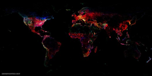
And look! It’s just produced a tiny bundle of something: a trio of maps, wrapped in a cover sheet titled Calibration Run #37A: Pretty Pictures. Let’s see… according to the manifest, they’re test visualizations of the GeoNames global place name database. Each of the 7.5-million geographic features within is represented by a single dot, colored additively: blue for water, green for land, and red for manmade structures, settlements, cultural locations, and the like. Here’s the world view:
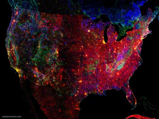
Let’s zoom into the two biggest hotspots. First, the United States:
Cities, packed with land and manmade features, glow bright yellow. In the West, the green peaks of the Rockies jog northwest into the watery blue tints of the Cascades. Rivers and reporting inconsistencies expose some state boundaries, as well as the Mexican and Canadian borders.
All in all, the data checks out, except for the pair of mysteriously-dense blobs in the lower Appalachian backcountry. What’s going on there? Perhaps the Hatfields and McCoys took great pride in their place names, and the feuding started with a dispute about the local terrain. “The big hill over yonder? We’ze gonna call it Squealin’ Pig Peak.” “Nah, that’s Grandpa’s Knob.” “Squealin’ Pig Peak!” “Grandpa’s Knob!” Bam bam bam!
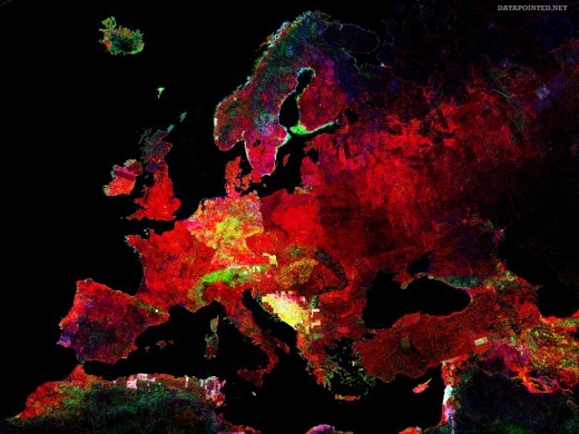
On that note, let’s segue to the ancestral homeland of the Hatfield and McCoy clans – the vicinity of the greater European Union:
These are great examples of what I call emergent visualization: the complex beauty that can be distilled from a mountain of data with a carefully-selected set of simple rules.
Hope you enjoyed them. The Visualizationator’s just warming up, so stay tuned for further developments…


