Mercator shrinks the Equator! Thus protest Kai Krause and a billion Africans, upset that the Mercator projection – used by Google Maps and found on countless grade school walls around the globe – makes their vast continent look positively puny compared to the rest of the world.
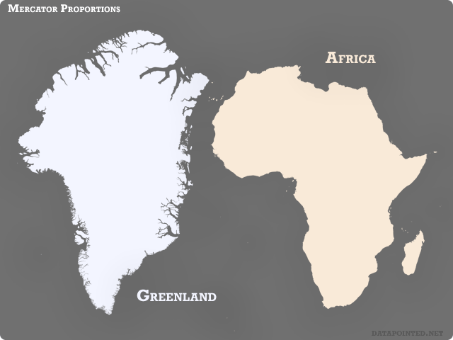
And they’re right! For example, consider icy Greenland. At 836,000 square miles, it’s only 7-percent of the land area of Africa. However, à la Mercator, the two appear equal:

Why? As with any map projection, Mercator is a trade-off. Ancient compass-wielding navigators loved Mercator’s lines of constant heading, and without its faithful local angles and parallel lines of latitude/longitude, online maps would be downright confusing. The mathematical cost? Magnification, fun house mirror style! Mercator oversizes Greenland because it sits so much closer to the poles than Africa.
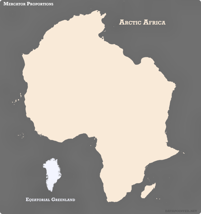
So, for equality sake, let’s do a switcheroo. What would happen if we swapped Africa with Greenland – dragging the Mediterranean coast up to 81 degrees North and the ice cap south to the Equator? Well, besides a bunch of sunburnt Inuit and shivering Egyptians, we’d see something like this:

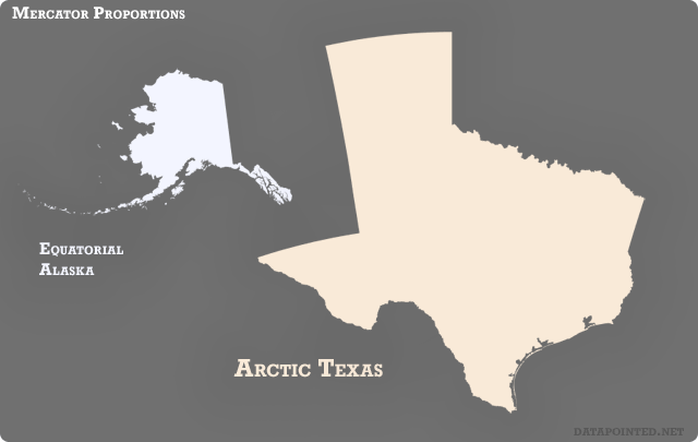
And why stop there? The tropical and poleward Mercatorisms of the two largest States:

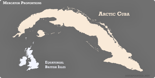
Finally, equatorial Fish-and-chips-land versus arctic Cuba:

Flush with projection-induced bravado, our cigar-chewing comrades snipe:
¡Con el norte y el proyección de Mercator, Los enterraremos!