Yes, indeed, it’s back-to-work Monday. Let’s kick the week off right, with four excellent “online business” infographics from the Intertubes!
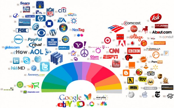
Brand Colors
COLOURLovers organizes the 100 top Web brands by hue and finds that big-company logos prefer to dress themselves in blue and red:
Growth opportunities in pink, purple, and green!
Favicon Web
See that tiny logo next to your browser’s address bar? That’s a favicon, the adorable, low-fidelity, hand-crafted, 16×16-pixel essence of an online brand! Enter NMAP’s impressive Icons Of The Web, a huge mosaic of the Internet with each site’s favicon scaled by traffic:
Ponder this: if each took an hour to create, those 290,000 favicons represent an astounding 34 solid [wo]man-years of pixel-diddling. Designers of the world, you deserve a pat on the back. Pat.
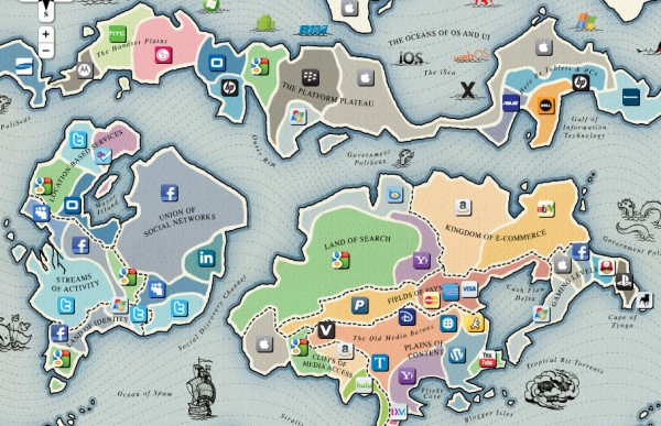
The Battleground
Now, we see what these companies are fighting for – the vast, fertile continents of the Internet – as mapped by the Web Summit 2.0′s Points Of Control infographic:
Who will prevail? Our next infographic might give us some clues…
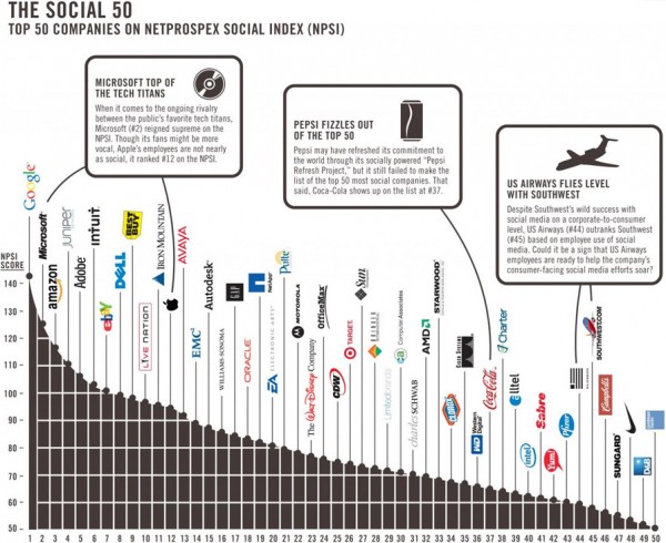
Friendliness And Reach
NetProspex ranks the online “friendliness and reach” of the employees of major corporations and charts their Social 50:
Is business a meritocracy – about what you know? Or a schmoozefest – about who you know? Apparently, either way, Google wins!


