Did the onerous income taxes of the 1950s and ’60s affect the behavior of big-money boxers? The Atlantic’s Henry Fetter believes so, as he explains in his recent article:
The 1950s was the era of the 90 percent top marginal tax rate, and by the end of that decade live gate receipts for top championship fights were supplemented by the proceeds from closed circuit telecasts to movie theaters. A second fight in one tax year would yield very little additional income, hardly worth the risk of losing the title. And so, the three fights between Floyd Patterson and Ingemar Johansson stretched over three years (1959-1961); the two between Patterson and Sonny Liston over two years (1962-1963), as was also true for the two bouts between Liston and Cassius Clay (Muhammad Ali) (1964-1965). Then, the Tax Reform Act of 1964 cut the top marginal tax rate to 70 percent effective in 1965. The result: two heavyweight title fights in 1965, and five in 1966. You can look it up.
The theory makes perfect sense, and yes, you read that right: back in the ’50s, the marginal rate of the uppermost individual Federal income tax bracket was indeed an incredible 90-percent! In other words, after making a certain amount of money, nine out of ten of your hard-earned dollars went straight to the man. If I had a demotivational font, I’d use it here to type “Ouch!”
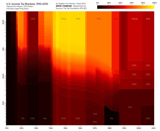
In 1965, the top tax rate fell to 70%, and it stayed there until Reagan swaggered into the joint and knocked everyone on their asses. By the end of his second term, as he gave a parting high five to the incoming Bush, he’d gutted the upper bracket to a millionaire-friendly 28% on all earnings over $160,000 – in today’s dollars! Trickle down, baby!
Three decades later, the Gipper is long gone, but the tax code legacy of Reaganomics lives on. To illustrate, our infographic team charted the historical U.S. income tax brackets for singles, adjusted for inflation, from 1910 to present:
The colors indicate the marginal tax rate: black for low, red in the middle, and yellow for high. The horizontal axis is the tax year, and the vertical represents taxable income, log-scale, normalized to 2010 dollars with the Bureau Of Labor Statistics’ monthly CPI-U figures. The bracket data comes from The Tax Foundation and the IRS, and the effects of Social Security, capital gains, AMT, and other tax varieties are not included.
Do you know a wealthy someone who’s afflicted by a habitual carping about their income taxes? Get him or her near a computer, pull up this graph, point them towards the brilliant yellow-orange brackets that run from the Great Depression ’til the Reagan-Bush tag team, and they shall be healed!
